Fine Specimens: Unpacking the Finer Details of Typography

The Unseen Art: Why Typography Matters Beyond Fonts
Typography is often described as the silent language of design, the unseen force that guides the reader's eye and influences their perception. It’s more than just choosing a font; it’s an intricate craft that involves a myriad of subtle decisions, each contributing to the overall aesthetic and communicative power of a text. From the meticulous spacing between letters to the careful selection of a typeface, the "finer details" are what transform mere words into compelling visual experiences.
Understanding the Anatomy of Fine Typography
Achieving truly fine typography requires an understanding of its core elements:
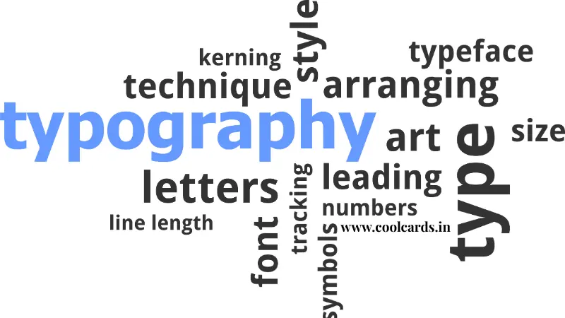
- Kerning: The adjustment of space between individual characters to improve legibility and appearance. A perfectly kerned headline feels balanced and professional.
- Leading (Line-height): The vertical space between lines of text. Too tight, and text feels cramped; too loose, and it loses cohesion.
- Tracking: The uniform adjustment of space across a range of characters. Useful for condensing or expanding entire blocks of text.
- Hierarchy: Using different sizes, weights, and styles to guide the reader through content, establishing importance and flow.
- Contrast: The interplay between different typefaces or weights to create visual interest and distinguish elements.
- Legibility & Readability: Ensuring text is easy to distinguish (legibility) and comfortable to read for extended periods (readability).
Mastering these elements is crucial for designers aiming to create specimens that are not only beautiful but also highly functional.
Current Trends Shaping the Typographic Landscape
The world of typography is dynamic, constantly evolving with technological advancements and shifting aesthetic preferences. Some notable trends include:
- Variable Fonts: Offering unprecedented flexibility, these fonts allow for continuous adjustments across multiple axes (weight, width, slant, etc.) from a single font file, revolutionizing responsive design.
- Bold & Expressive Type: Designers are increasingly using large, impactful typefaces to make strong statements, often serving as the primary visual element.
- Retro Revival: A nostalgic nod to past eras, particularly the 70s, 80s, and 90s, bringing back distinctive serifs, sans-serifs, and display fonts with a modern twist.
- Responsive Typography: Beyond just scaling, this involves intelligent adjustments to font size, line height, and even font choice based on screen size and device capabilities.
The Profound Impact of Meticulous Typographic Choices
The finer details in typography have a profound impact on various aspects of design and communication:
- Brand Identity: A carefully chosen and consistently applied typeface can become synonymous with a brand, conveying its personality and values.
- User Experience (UX): Good typography enhances UX by making content easier to consume, reducing cognitive load, and guiding users through interfaces intuitively.
- Emotional Connection: Typefaces evoke emotions. A delicate script might suggest elegance, while a robust sans-serif could convey strength and modernity.
- Readability and Comprehension: Ultimately, the goal is for information to be easily absorbed. Fine-tuned typography ensures optimal readability, leading to better comprehension.
Conclusion: The Enduring Craft of Typography
Typography, at its heart, is a delicate balance of art and science. It’s a craft where every subtle adjustment, every deliberate choice of space and form, contributes to a larger narrative. The "finer details" are not just aesthetic flourishes; they are fundamental building blocks that dictate how information is perceived, how brands are remembered, and how stories are told. As designers continue to push boundaries, the appreciation for these meticulous elements ensures that typography remains a vibrant and essential pillar of visual communication.


