YouTube Thumbnail Design: The Exact Formula Top Creators Use

In the crowded landscape of YouTube, your video thumbnail is often the make-or-break element determining whether a viewer clicks or scrolls past. It's not just a picture; it's a powerful marketing tool, a micro-billboard competing for attention. Top creators don't leave this to chance; they employ a precise, repeatable formula for YouTube thumbnail design that consistently drives higher click-through rates (CTR).
The Core Pillars of a Clickable YouTube Thumbnail
While creativity plays a role, the most effective YouTube thumbnail designs adhere to several fundamental principles:
1. Clarity and Instant Comprehension
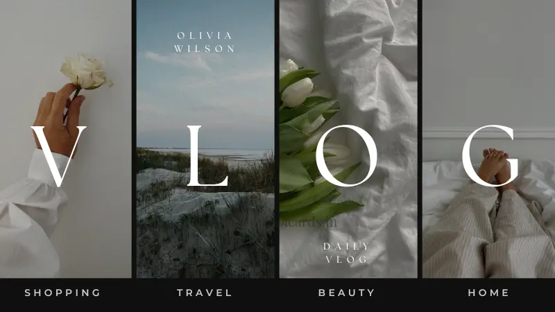
- Single Focal Point: A good thumbnail immediately draws the eye to its most important element. Avoid clutter.
- Large, Readable Text: If you use text, make it minimal (2-5 words max) and in a bold, easy-to-read font with high contrast against the background. Remember, many viewers browse on mobile.
- Clear Imagery: The primary image should be sharp, relevant, and immediately convey the video's essence.
2. Emotional Connection and Storytelling
- Expressive Faces: Human faces, especially those displaying strong emotions (excitement, surprise, shock), are incredibly effective at grabbing attention and creating relatability.
- Intrigue and Curiosity: A thumbnail should pose a question, hint at a solution, or create a sense of mystery without giving everything away.
- Before-and-After / Problem-Solution: Visually representing a transformation or a challenge being overcome can be highly compelling.
3. Strategic Color Psychology and Contrast
- High Contrast: Colors that stand out against each other, both within the thumbnail and against YouTube's interface (white/dark mode), are crucial. Bright, vibrant colors often perform well.
- Limited Color Palette: Using 2-3 dominant colors can make a thumbnail look professional and cohesive.
- Brand Consistency: While experimenting, top creators often maintain a consistent color scheme or styling element that helps viewers recognize their content instantly.
4. Visual Hierarchy and Direction
- Arrows and Circles: Subtle visual cues like arrows pointing to key elements or circles highlighting important details can guide the viewer's eye.
- Z-Pattern or F-Pattern: Understand how viewers typically scan screens and design your elements to follow these natural eye movements.
Implementing the Formula: Actionable YouTube Thumbnail Tips
Now that you understand the pillars, here's how to put them into practice to craft a truly clickable thumbnail:
- High-Resolution Base Image: Always start with the best quality image or screenshot from your video.
- Embrace Negative Space: Don't feel the need to fill every inch. Strategic empty space can make your main elements pop.
- Use Outlines and Drop Shadows: Adding a thick white or contrasting outline around text or key subjects helps them stand out. A subtle drop shadow can add depth.
- Test on Different Devices: What looks good on a desktop screen might be illegible on a phone. Always check your design scaled down.
- A/B Test Relentlessly: Even top creators don't get it right every time. Use YouTube's analytics to see which thumbnails perform best and iterate. Tools like TubeBuddy or VidIQ can assist with A/B testing.
- Study Your Niche: Analyze what thumbnails are performing well for successful channels in your specific niche. What trends can you adapt or improve upon?
- Avoid YouTube's Logo Traps: Be mindful of the time stamp and other YouTube UI elements that might cover crucial parts of your thumbnail, especially in the bottom right corner.
Conclusion
Mastering YouTube thumbnail design is a continuous journey, but by adhering to this exact formula used by top creators, you can significantly boost your YouTube CTR and unlock more views for your content. Prioritize clarity, evoke emotion, use color strategically, and always be willing to test and refine. Your thumbnail is your video's first impression—make it count.


